

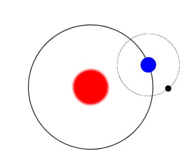
CSS3动画animation通过rotate()实现旋转的星球效果
旋转的星球主要通过rotate()旋转函数来实现。实际上,蓝色的地球和黑色的月球并没有发生旋转,只是其父级旋转形成的视觉上的旋转效果、正方体合成)
例子1:
<!DOCTYPE html>
<html>
	<head>
		<meta charset="UTF-8">
		<title></title>
		<style type="text/css">
			.box{
    transform: scale(0.5);
    position: relative;
    padding: 1px;
    height: 300px;
    width: 300px;
}
.sunline{
    position:relative;
    height: 400px;
    width: 400px;
    border: 2px solid black;
    border-radius: 50%;
    margin: 50px 0 0 50px;
    display: flex;
    animation: rotate 10s infinite linear;
}
.sun{
    height: 100px;
    width: 100px;
    margin: auto;
    background-color: red;
    border-radius: 50%;
    box-shadow: 5px 5px 10px red,-5px -5px 10px red,5px -5px 10px red,-5px 5px 10px red;
}
.earthline{
    position: absolute;
    right: 0;
    top: 50%;
    height: 200px;
    width: 200px;
    margin: -100px -100px 0 0;
    border: 1px solid black;
    border-radius: 50%;
    display: flex;
    animation: rotate 2s infinite linear;
}
.earth{
    margin: auto;
    height: 50px;
    width: 50px;
    background-color: blue;
    border-radius: 50%;
}
.moon{
    position: absolute;
    left: 0;
    top: 50%;
    height: 20px;
    width: 20px;
    margin: -10px 0 0 -10px;
    background-color: black;
    border-radius: 50%;
}
@keyframes rotate{
    100%{transform:rotate(360deg);}
}
		</style>
	</head>
	<body>
		<div class="box">
    <div class="sunline">
        <div class="sun"></div>
        <div class="earthline">
            <div class="earth"></div>
            <div class="moon"></div>
        </div>
    </div>
</div>
	</body>
</html>
动态效果点:上面的运行代码来看
【鼠标移入元素内停止运动的实现】
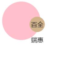
如果要在内侧旋转的球内放文本,并且文本不跟着旋转,则代码如下
例子2:
<!DOCTYPE html>
<html>
	<head>
		<meta charset="UTF-8">
		<title></title>
		<style type="text/css">
			@keyframes spin{
				100%{transform:rotate(1turn);
				}
				}
.outer{
	width: 100px;height: 100px;background-color: pink;border-radius: 50%;animation: spin 3s linear infinite;animation-play-state:running;text-align: center;
	}
.inner{
	width: 40px;height: 40px;line-height:40px;background-color: tan;border-radius: 50%;animation: inherit;animation-direction:reverse;
}
div:hover,div:focus{
  animation-play-state:paused;
}
		</style>
	</head>
	<body>
		<div class="outer">
    <div class="inner">期权记</div>
  </div>
	</body>
</html>
原文链接:https://www.qiquanji.com/post/8031.html
本站声明:网站内容来源于网络,如有侵权,请联系我们,我们将及时处理。
版权声明
本文仅代表作者观点,不代表本站立场。
本文系作者授权发表,未经许可,不得转载。